Re-Designing SafeCo’s Verifying Website

What is SafeCo Insurance?
SafeCo is a national insurance company that is a branch off of the Liberty Mutual Insurance Company. SafeCo provides car, home, life, health, boat, and farm insurance to consumers nation wide.
SafeCo’s Verifying Website
SafeCo is a well established insurance company with enough money to buy the best design teams for their websites. If I am just a consumer looking to purchase insurance, SafeCo’s homepage is user-friendly and extremely easy to navigate (Figure 2). However, if I am an agency that represents SafeCo, the website that agents have to use in order to verify insurance is lacking in many areas (Figure 3).
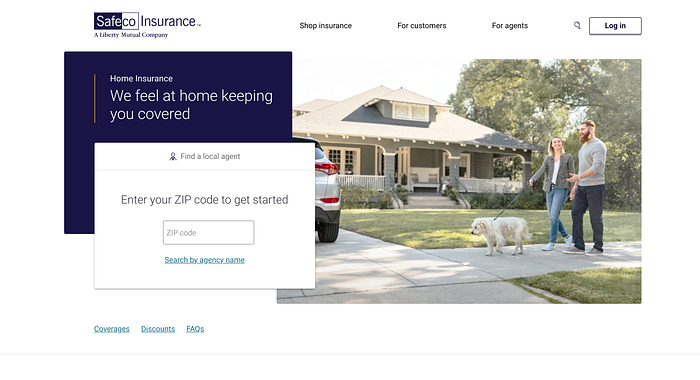
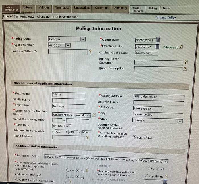
As seen in the two images on the left, they are totally different and not even remotely aesthetically similar.
I have worked in the insurance world for almost six years now, and SafeCo’s verification website is worse than any of the other sixteen companies that we represent at Chastain and Associates. It is so bad our agents will actively try to use another company in order to avoid using SafeCo’s verifying website.
What is a Verifying Website?
How SafeCo’s verifying website is utilized at Chastain and Associates is pretty straight forward. When a new customer is seeking car insurance, we gather their information and input it into a system called PL Rating. PL Rating then takes the information, and based on the specific information given, it gives a comparison quote sheet that compares all the rates of the different companies Chastain and Associates represents for that particular client. PL then puts the quote in numerical order (from best rate to worse). Based on the different factors, every client’s quote sheet looks different because insurance in general is so finicky. Once we see what the best rates are, we must go into the best rated companies (usually the top 3 companies presented) in order to verify that company and run the proper reports for that particular client. Once we go into that company, check all the information, run the reports, and answer underwriting questions, we then get an official quote proposal that we can present to our potential client. It is crucial that this process is quick and efficient for the experience of our employees as well as the experience of our customers.
Why SafeCo’s Verification Website?
SafeCo’s verification website is a hassle for all of our employees, and I noticed issues with it after the first time I interacted with it. The design is lacking, user-interface is a struggle, there are steps in the website that should be removed, and each tab is crowded with unneeded information. My goal is to redesign this website into a user-friendly and aesthetically pleasing website that is pleasurable for our agents to use which, in return, will make our customers happy as well.
Current-State Journey Map
In order to properly see the potential within SafeCo’s verification website, I decided to utilize a current-state journey map to demonstrate how our agents currently feel when they are utilizing SafeCo’s website.

Problems
As seen in the journey map, there is some issues that need to be addressed in my re-design. Starting off with the overcrowding of information on one page. This overloads our agent’s cognitive capacity which makes checking the information even more difficult. The overcrowding of information also leads to a smaller font size, and when checking drivers license numbers and birthdays, the font needs to be large enough to check easily. Next is the functionality of this website that does not make sense to me. SafeCo makes you input and verify all the information, gives you an estimated summary, makes you run reports (if they have a wreck or a ticket on their record, their insurance will increase substantially), takes you all the way back to the beginning of the quote process, makes you double check your information that was inputed, then gives you the real quote summary at the end with the real rate on it. Once you go through this whole process, if the rate is still one of the lowest, we present it to our client. There are just some unneeded steps in the SafeCo verification website that, if removed, could save time, effort, money, and a whole lot of frustration.
Solutions
Starting off with the design, I would add a sub-menu to the navigation bar in order to break up some of the information that is on each tab. This will allow me to increase the font-size, and make more important information stand-out more for our agents. I would also move the navigation bar to the left side of the screen and make it float. This would allow quick and easy access for our agents to go from tab to tab if need be. I would also make the interface more aesthetically pleasing, and make buttons and links stand out more. In terms of functionality, I would take out the estimated summary step, I would remove our agents having to double check their work, and I would place the “Run Order Reports” tab in front of the final summary tab. If I can make all of these improvements, our agents will have a much faster turn-around when it comes to verifying in SafeCo. A quick turn around means a happy client, and a happy client is always good for business.
Future-State Journey Map
This future state journey map is a potential journey map for my future redesign of SafeCo’s website. This journey map took all of the previous problems in the Current-State map and alleviated them. As you can see, the future-state map is smaller because some steps were removed for functionality purposes.
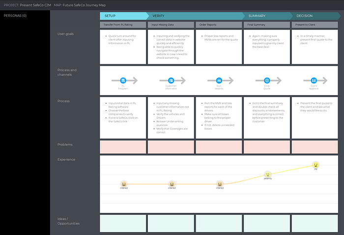
As you can see, the user experience is on the steady incline when using my redesign version of SafeCo’s website.
Current Website

My Prototypes


What I Accomplished
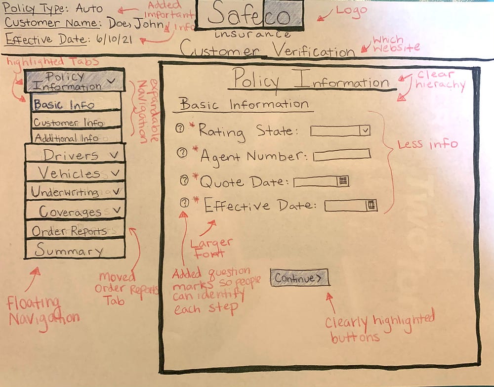
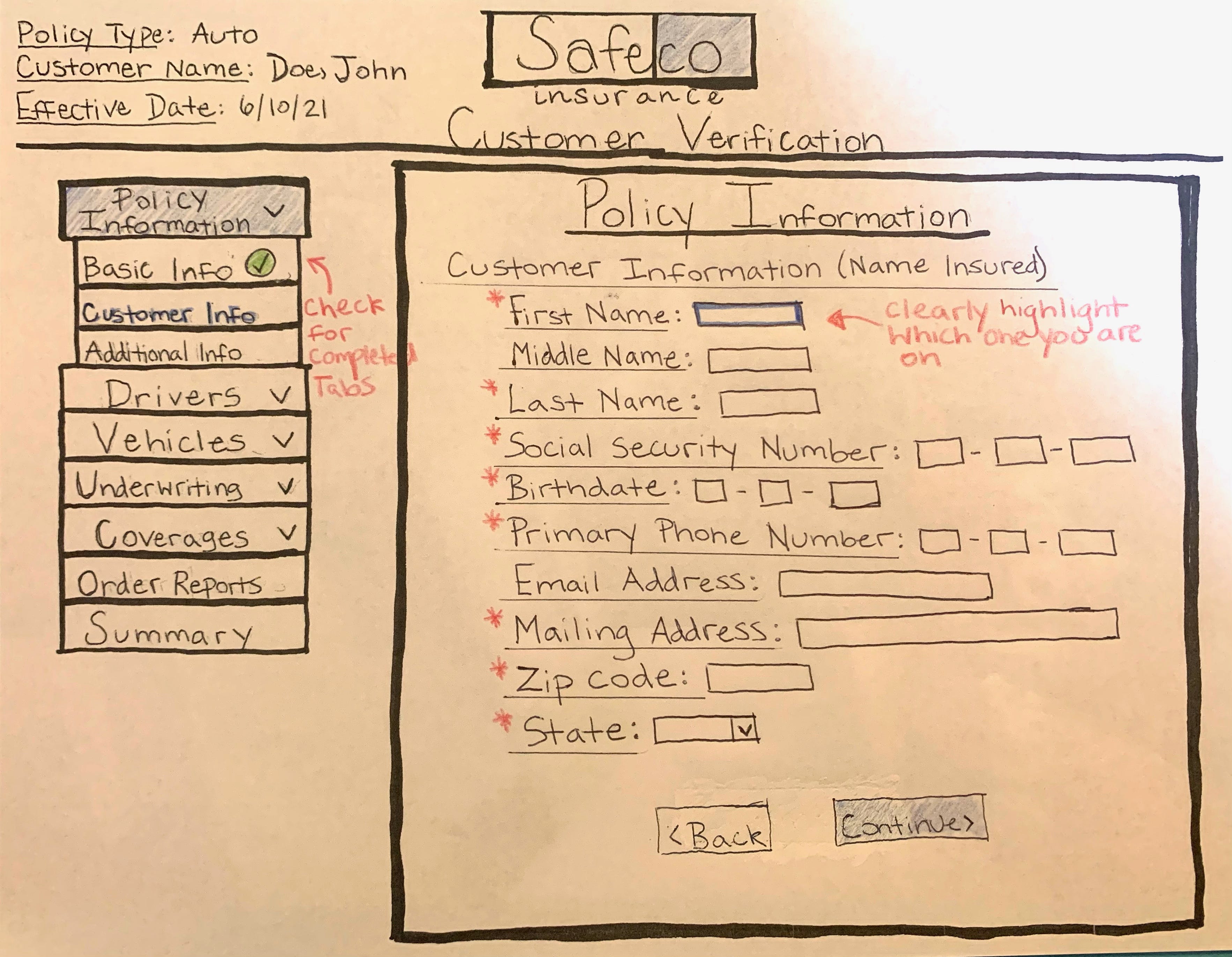
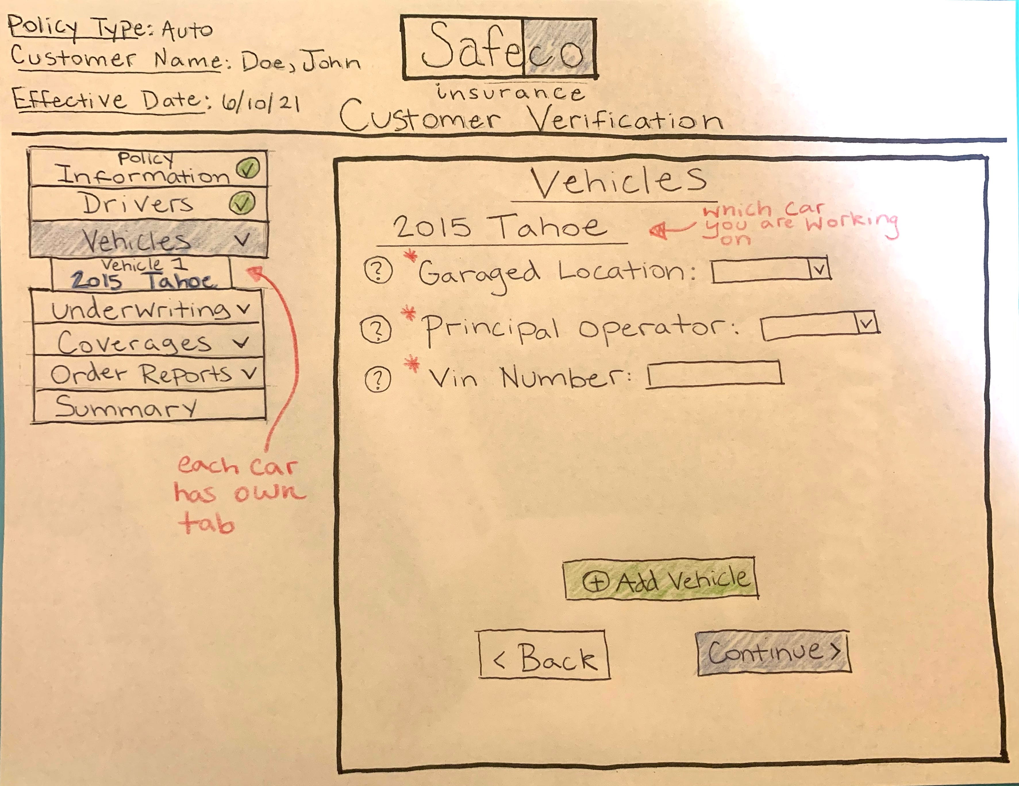
As seen in the prototypes above, I want to give the whole website a facelift and improve our usability for our agents.
- I added a floating navigation bar to the left to make it easier for our agents to click from tab to tab at any give time.
- I added a sub-menu which allowed me to break up information so it is not all bunched together.
- I created a clear hierarchy with the usage of font size and different fonts.
- I highlighted selected tabs and buttons so our agents know exactly where they are in the website and where the need to go.
- I added important information to the top left, so even at a glance our agents can see what kind of policy they are working on, and the customer they are working on. We quote multiple people a day, so sometimes we forget who we are working on.
- I moved the order reports tab in front of the summary tab which eliminated some unneeded steps.
- I removed a lot of unneeded information.
- I added the company logo and specific website that is in use to the top of the site.
- I added green check marks beside the completed tabs so our agents know exactly where they have been throughout the website.
I wanted to make the overall website more practical and easier to use for our agents. By making the website easier to navigate, important text easier to spot, and removing certain steps, we can improve our quick turn around process for our SafeCo quotes.